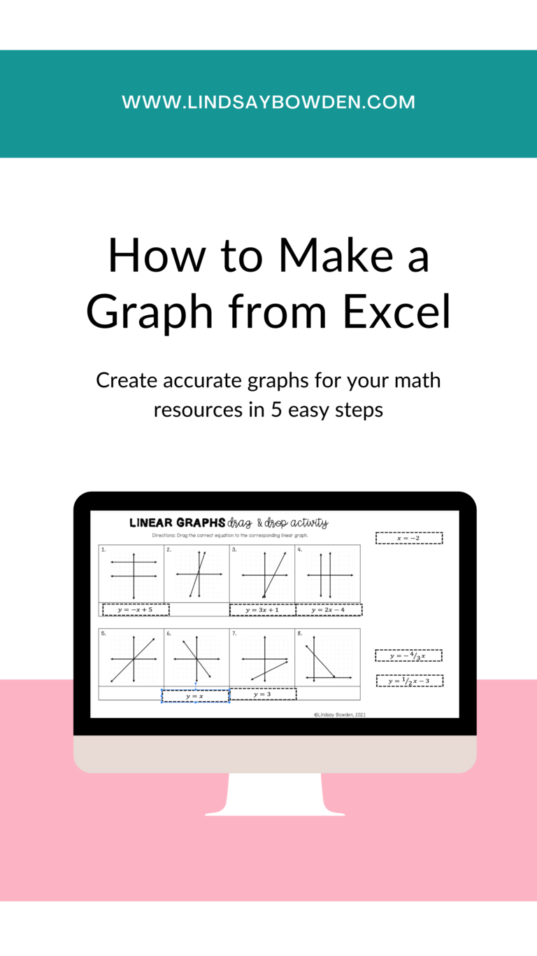
Have you ever wanted to make your own graphs for your classroom activities? It can be difficult to find the perfect graph to match your students’ needs, and making your own graphs doesn’t have to be complicated! Making graphs in Excel is simple and will make your math resources look professional and polished.
If you don’t already have Excel downloaded on your computer, you can get Office 365 for FREE with your school email. This includes Microsoft Word, PowerPoint, Excel, and OneNote. This blog post will reference both PowerPoint and Excel, so make sure you have them both downloaded.
Step 1: Insert a Graph in PowerPoint
Although you will be creating your graph using Excel, you will want to start in PowerPoint to format your graph so that it is resource-ready. Using PowerPoint and Excel together allows you to create a professional-looking graph directly within your math resource.
If you are new to using PowerPoint to create math resources, you may want to start with this blog post. It will help you set up your PowerPoint page so it is ready for a graph.
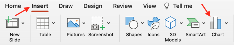
Once your PowerPoint page is ready, click “Insert” and “Chart”.
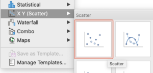
Next, choose “X Y (Scatter)” and select the first option called “Scatter” for a basic coordinate plane or to graph a straight line or polygon. To graph a more advanced function with curved lines like a quadratic or exponential function, choose the second option called “Scatter with Smooth Lines and Markers”.
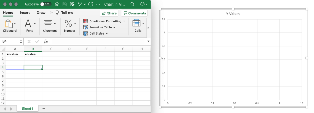
An Excel workbook will automatically open and a graph will appear on your PowerPoint presentation.
Delete any preset values in the Excel workbook and minimize it. Your Excel workbook and PowerPoint graph should look similar to the ones below.
Step 2: Edit the Graph in PowerPoint
There are so many options for editing graphs in PowerPoint, but this post will just cover the basics. If you would like to customize your graph even more, play around with the options in PowerPoint to get it exactly how you want!
Title
Start by removing the automatic title “Y-Values” from the graph. You can change it to what you want by double-clicking and typing. Or you can remove it altogether by clicking and pressing the delete or backspace button on your keyboard.
Axes
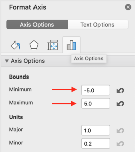
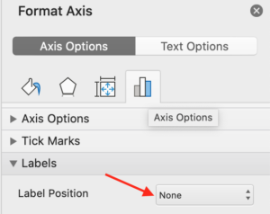
Next, adjust the x- and y-axes. Start by double-clicking the x-axis on the graph. A menu called “Format Axis” will appear on your screen. Choose the option to the far right with the image of a bar graph called “Axis Options”. From here, you can adjust the minimum and maximum bounds, major and minor units, and add axis labels if you wish.
The following settings will create a coordinate plane with values ranging from -5 to 5 on the x-axis and no axis labels.
Click on the y-axis on the graph and repeat these steps.
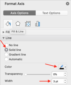
Next, you can add arrows to and change the color of the x- and y-axes. Select the x-axis on the graph and choose the paint bucket on the far left of the “Format Axis” menu called “Fill & Line”.
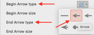
Choose the “Line” tab to adjust the axis color, thickness, and arrows. You can adjust these settings in any way you want, so play around with them until you find what you like!
The following settings will create an axis with a thick, black line and arrows on both ends.
Click on the y-axis on the graph and repeat these steps.
Grid Lines
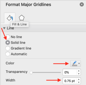
You may also need to adjust the grid lines on your graph. To change the color and thickness of the grid lines, double-click one of the vertical grid lines. This will select all of the vertical grid lines (there will be blue dots at the top and bottom of each line). A menu called “Format Major Gridlines” will open on your screen.
Click the paint bucket on the far left called “Fill & Line” to adjust the color and thickness of the vertical grid lines. It is usually best to keep the grid lines a different color and thickness from the x- and y-axes so you can easily tell them apart.
The settings below will create grid lines that are gray and slightly thinner than the x- and y-axes created in the step above.
Select the horizontal grid lines and repeat these steps.
Step 3: Add Points
If you are creating blank coordinate planes for your students to use, you can skip this step. But if you would like to add points or lines to the graph, keep reading!
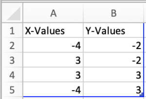
Maximize the Excel workbook that was created when you started your graph. Make sure all preset points are deleted. Add the points you need in the columns labeled “X-Values” and “Y-Values”. You can create many kinds of graphs here, so feel free to play around with this step using formulas in Excel!
The points below will create the corners of a rectangle.
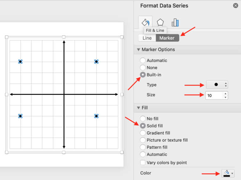
Once you have the points you need, they will automatically appear on your graph and you can adjust the color of them. Going back to PowerPoint, double-click one of the points on the graph to select all of the points. A menu will open called “Format Data Series”.
Choose the paint bucket on the far left called “Fill & Line” then choose the “Marker” tab. You can adjust the color and thickness of the points on your graph however you would like. The following settings will create bold, solid black points.
Step 4: Complete the Graph
There are just a few more things to do to complete your graph! If you have created a basic line or polygon, you will need to add the outline of the shape now.
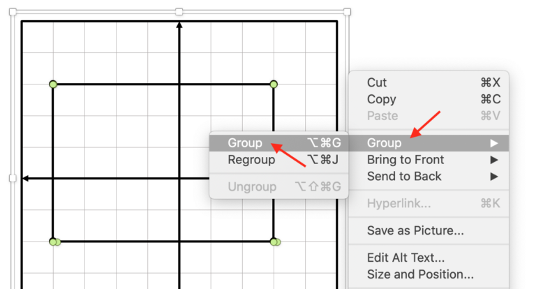
Select “Insert” then “Shape” to add lines connecting your points. Simply draw the lines on top of the graph connecting one point to the next. Adjust the color and weight of your line so it looks exactly how you want.
Next, make sure all the lines you added are grouped together on the graph. To do this, hold down the shift button on your keyboard and select each individual line as well as the entire graph. Let go of the shift key, right click, select “Group”, and then select “Group” again. This will turn the coordinate plane and lines into one solid piece in PowerPoint.
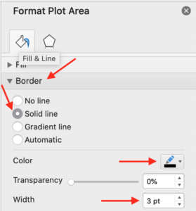
You may also want to add an outside border to your graph. To do this, double-click the outside border line of the graph. A menu called “Format Plot Area” will appear and you can select the paint bucket on the far left called “Fill & Line”. Select the “Border” tab and adjust the line color and thickness however you would like.
The following settings will create a thick, solid black border outside the graph.
Step 5: Save it for Later
Lastly, you can save your graph as a picture to use in other resources. You may want to create a folder on your computer to save your graphs each time you create a new one so that you can easily reuse them in the future.
To save your graph, select the farthest outside border, right click, and choose “Save as Picture”.
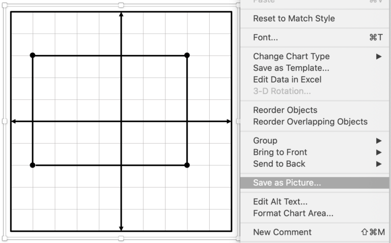
Select where you want your picture to be saved and what file type you want. PNG or JPEG are good options for images. Choosing JPEG will save your picture with a white background and choosing PNG will save your picture with a transparent background.
Now you can reuse this graph in the future by inserting the image into your other resources!

Want to learn more?
I hope you have enjoyed learning how to make a graph from Excel! If you like making your own graphs, you may want to make other types of resources as well. You can sign up for my free training here if you would like to learn more about the types of resources you could create!