Have you ever wanted to make graphs on your own? Creating your own graphs can make your life so much easier! I create all of my own graphs using two programs I already had on my computer: Microsoft PowerPoint and Microsoft Excel!
Then, I can use these graphs in any resource such as worksheets, notes, activities, assessments, and more!
Get a free printable cheat sheet for creating math resources here!
1. Choose your program

As I said before, I make all of my own graphs using PowerPoint and Excel. These programs were already on my computer, so I didn’t have to pay for any fancy software!
If you don’t already have these programs, you can get Office 365 for FREE with your school email. This includes Word, PowerPoint, and Excel.
While there are other graphic design programs out there, many of them cost money to use. And they usually don’t include things like equations and mathematics graphics. For that reason, I will only be referring to PowerPoint and Excel for the rest of this blog post.
2. Insert Graph
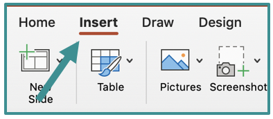
Start with a blank PowerPoint presentation. Delete any text boxes. If you are a PowerPoint newbie, you may want to start with this blog post. It will help you set up your PowerPoint page and get it ready for a graph.
Now, click “Insert” and “Chart”

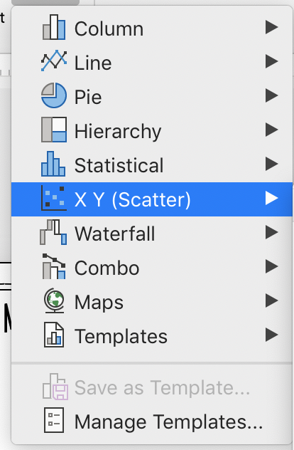
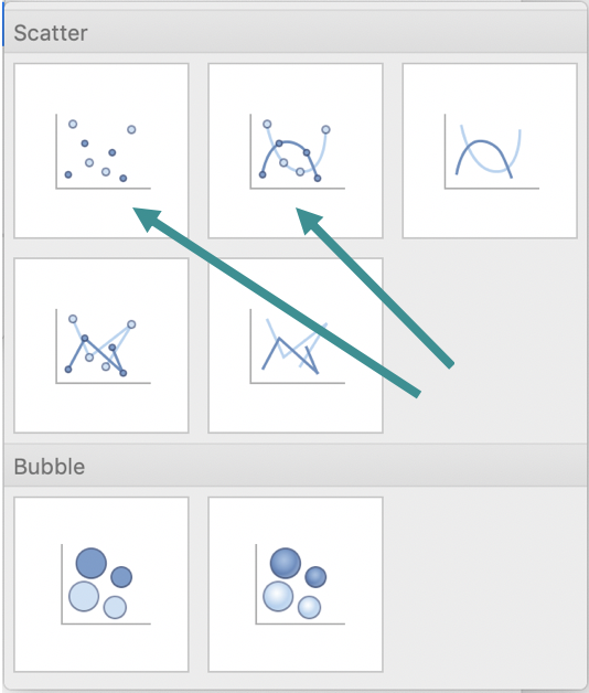
Choose “X Y (Scatter)” and choose the first or second option.
If you are making a polygon, circle, or a graph where the points are not connected (scatter plot), choose the first option. We can add line segments and circles later.
If you want your dots to be connected with a smooth curved line (for quadratics, exponentials, etc.), choose the second option.
An Excel workbook will automatically open, and a chart will appear on your PowerPoint presentation.

Don’t worry about the Excel workbook right now. We will get to that in step #4. For now, minimize the Excel window. Let’s edit the graph to make it look like a coordinate plane!
3. Edit Your Graph
I could make a whole blog post just about this one step, but I will try to keep it succinct. The more you play around with the options, the more you’ll see how much you customize your graph! It’s amazing what you can do.
Title
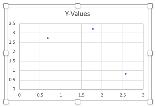
Let’s start with the title. There is automatic title “Y-Values”. Either change it to what you want by double-clicking and typing. Or delete it by clicking and pressing “delete” or “backspace”.
Axes
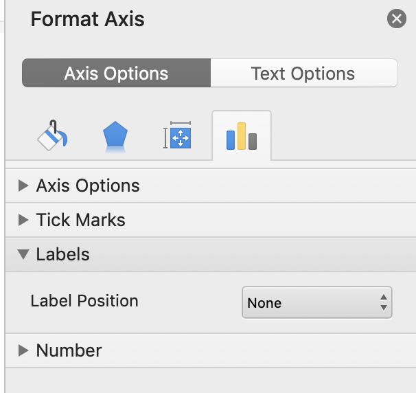
Next, let’s adjust the x- and y-axis. To change the scale, double-click the x-axis. A box will open on the side of your presentation that says “Format Axis”. Then, click the tab on the far right that looks like a blue, yellow, and gray bar graph. Here you can change the max and min of your axis as well as the labels. These are the setting I use for a 5×5 graph. I don’t like axis labels, but you can add them if you like.

Next, do the same thing for the y-axis.
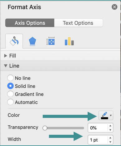
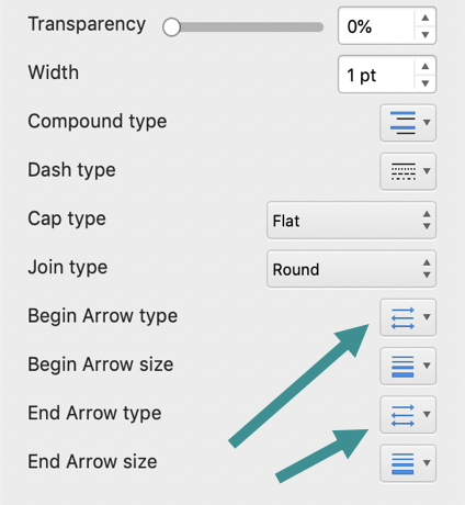
To add arrows and change the color of the x- and y-axis, click the paint bucket on the far left of your “Format Axis” box. Here, you can change the color and thickness of the lines and also add various ending shapes like arrows or dots. Arrows are usually best for a coordinate plane.
Grid Lines
To change the color and thickness of the grid lines, double-click one of the vertical grid lines. All of the vertical grid lines will become selected (you will see little blue dots at the top and bottom of each one) and a box will open that says “Format Major Gridlines”.
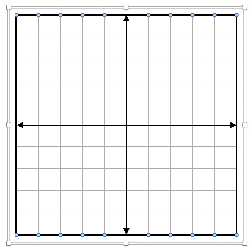

Click on the paint can and change the color and thickness using “Color” and “Width”. I like to keep my gridlines a dark grey so I can easily see the axes. Then, do the same thing with the horizontal gridlines.
Outside Border
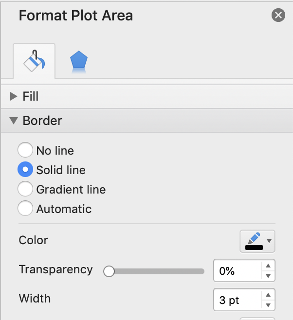
I like the outside border line of my graph to be dark grey or black. If you want to do that, double-click the outside border line of the graph.
A box will open that says “Format Plot Area”. Click on the “Border” tab and change the color and thickness of the border line. These are the settings that I like:
4. Add Points
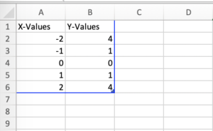
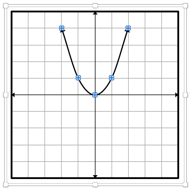
Now, let’s add some points to our graph! Maximize the Excel workbook and delete any preset points. Then add the points you need. The first column is the x-coordinate and the second column is the y-coordinate. Here are the coordinates I use for a simple parabola:
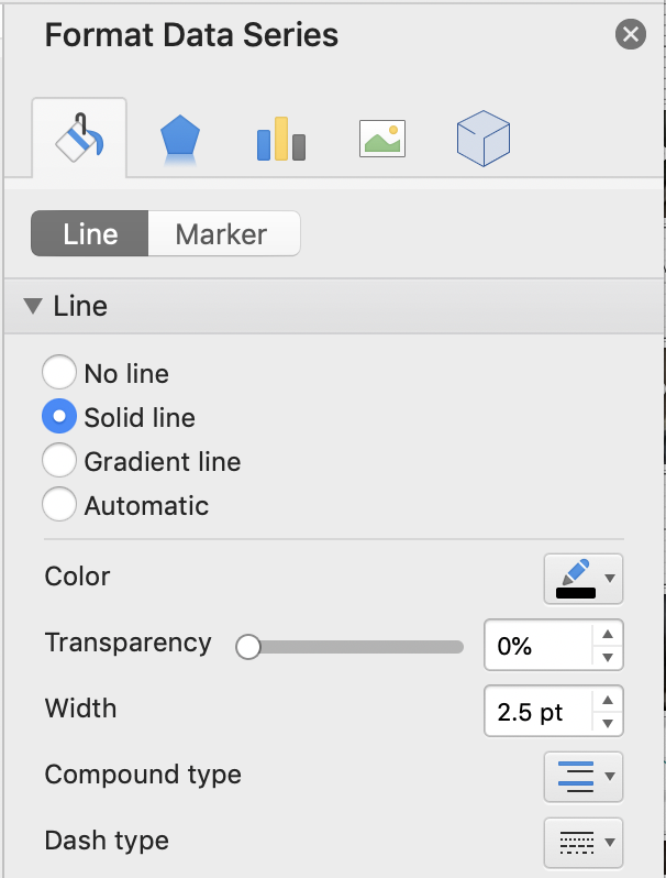
When you enter points, they will automatically appear on your graph. You can change the color of the points by going back to your PowerPoint and double-clicking one of the points. All of the points will become selected (in blue) and a box will appear that says “Format Data Series”.
Change the color of the line or marker (points) by selected the “Line” or “Marker” tabs. You can also add arrows to the end of your line and change the size of the points.
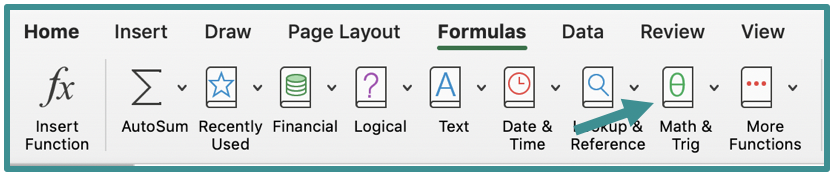
There are formulas in Excel for more complex graphs. To use these, go back to your Excel workbook and select the “Formula” tab at the top. Then click “Math & Trig”. Select the formula that you want.
The formulas can be a little trickier to use. If you are a beginner, I would stick with entering my own points.
5. Complete Your Graph
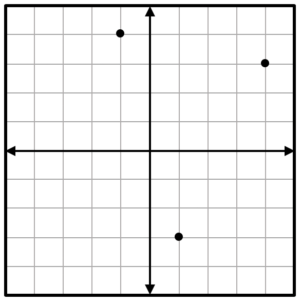
Now, let’s finish our graph! If you are making a polygon or circle, we need to add the shape outline now. You should have chosen the first chart X Y Scatter option, so you will only have points but no lines. For a circle, you would only have the center point.
Use the “Shape” tool and select either a line or circle. For a polygon, use a line to connect the dots. For a circle, draw the circle to the size you need and place on top of the graph.

Lastly, we can save our graph as a picture to use on other resources. You never know when you might want that graph again! It will save you time later if you make the graph a picture now.
I create a folder on my computer labeled “Graphs” and put all of my graph pictures there.
To save your graph, right click and select “Save as Picture”.
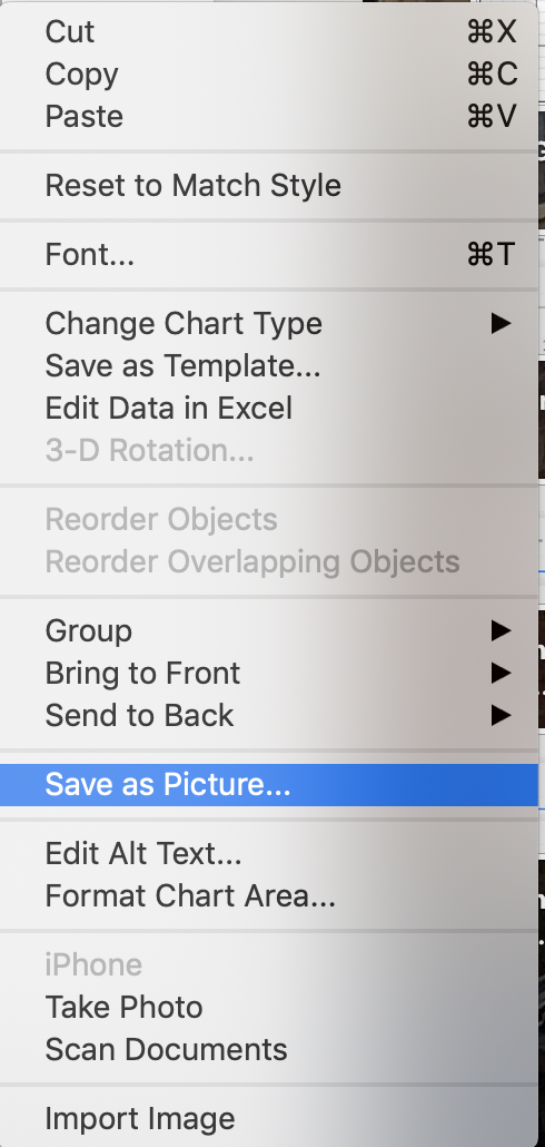
Select where you want the picture to go and what file type you want. I usually just put mine on my desktop and then move it to the correct folder.
I like saving mine as a PNG file because I can keep the background transparent and not white.
Now your graph is saved for future use!
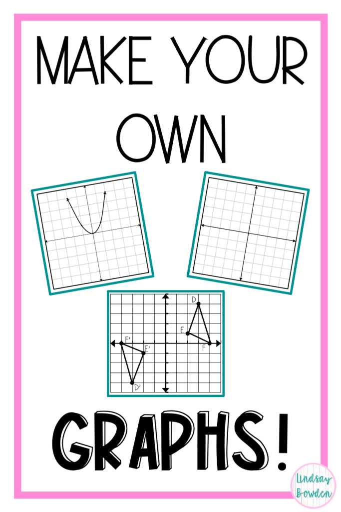
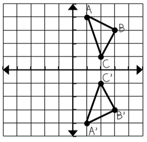
Here are some of the graphs I’ve created:


Next Steps
If you enjoy making graphs, you may also enjoy making your own resources! I make 100% of my own resources for my classroom including notes, worksheets, activities, assessments, and more. Remember, you can download the free step-by-step cheat sheet!
If you are interested in making your own teacher resources, you need to sign up for my FREE training at LindsayBowden.com/Training! You may also like these blog posts:
If you make your own graphs, let me know how it goes below!
Happy Teaching!