As you are creating math resources that include graphs, you may find yourself wondering how to add axis labels in Excel. This blog post will show you the exact steps you should take to get the axes on your graph looking exactly the way you want!
If you don’t already have Excel downloaded on your computer, you can get Office 365 for FREE with your school email. This includes Microsoft Word, PowerPoint, Excel, and OneNote.
Before you read any further, if you need help getting started with creating a graph for your math resources, check out this blog post!
Adding Labels to Your Graph
Once you have your graph created, follow these simple steps to add axis labels on your graph.
Click on the graph one time to select it. Once the graph is selected, click “Chart Design” in the top ribbon. After that, select the “Add Chart Element” drop down menu.
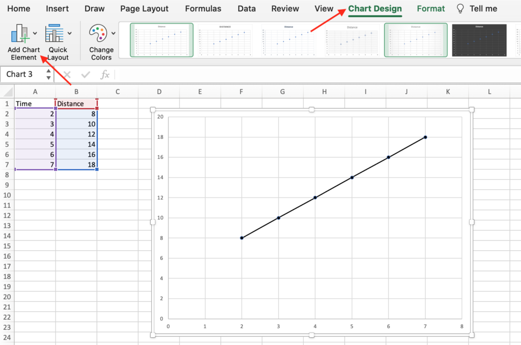
From the “Add Chart Element” menu, select “Axis Titles” and “Primary Horizontal”. Repeat these steps and select “Primary Vertical” also.
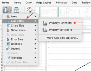
You may also want to include a title on the graph. To do this, go to the “Add Chart Element” drop down menu, then select “Chart Title” and either “Above Chart” or “Centered Overlay”.
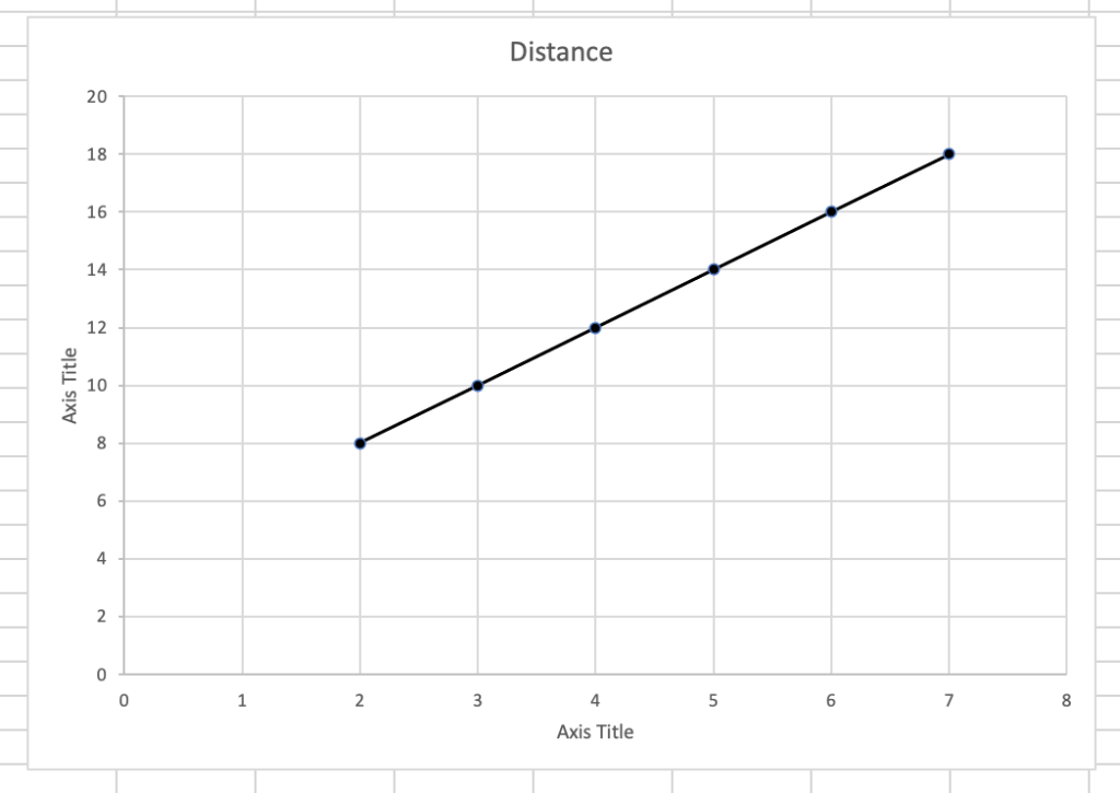
Once you have selected these options, your graph should look something like the one pictured below. To edit the axis labels, click the words on the axis label once, pause for a moment, and click the words again. The cursor should appear in the text box and you can edit the text as you would like.
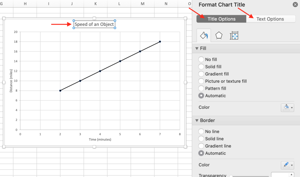
To change the color, border, fill, shadows, alignment, and more for each text box, select the text box. A menu will open called “Format Chart Title” or “Format Axis Title” depending on which one you select. On these menus, you can choose the options you prefer from the “Title Options” and “Text Options” tabs.
Voila! You now have customized axis labels for the graphs on your math resources!
Want to learn more?
I hope you have enjoyed learning how to edit axes in Excel! If you like making your own graphs, you may want to make other types of resources as well. You can sign up for my free training here if you would like to learn more about the types of things you could create!